
Challenge
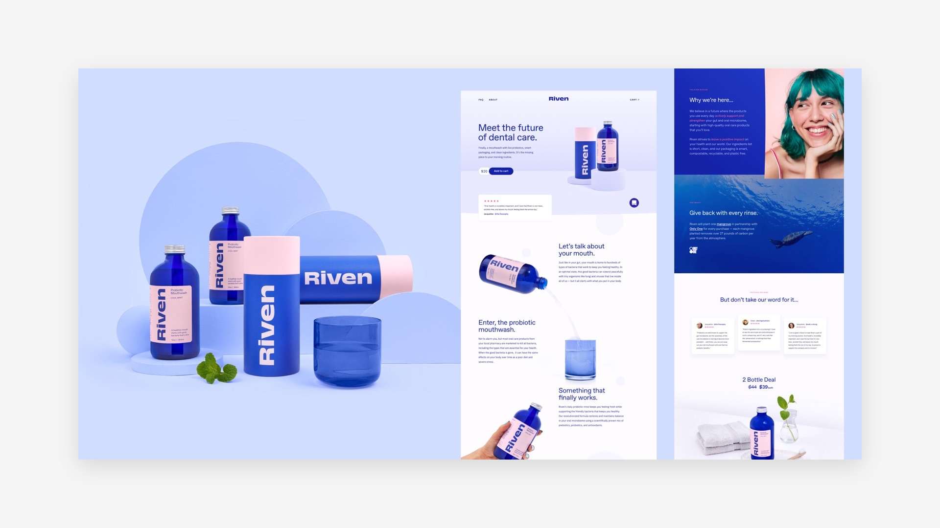
Riven started from a simple idea: mouths are better off without the harsh chemicals traditional brands rely on. The first probiotic mouthwash needed art direction, photography, and a web experience that could make a brand new category feel obvious and desirable.
Approach
Working directly with the product team, we coordinated art direction, photography, and web design as one effort: sharp, attractive packaging presented cleanly, clean ingredients front and centre, and a site that makes the science feel friendly.
Results
A cohesive launch presence across packaging, photography, and web, built to introduce a category people did not know they needed.
Impact
Riven entered a household category with a brand that looks nothing like the drugstore shelf, and the visual system carries the clean ingredient story everywhere it appears.
More work
Proof, by project.
United Nations ESCAP
Product strategy for UN innovation teams
A repeatable way to turn ideas into products, aligned to the UN's development goals.
Read the case study →
Bell Canada
Better dashboards through UX training
Sharper executive analytics and clearer decisions across the org.
Read the case study →
Awake Labs
Wearable tech for anxiety monitoring
Hospital-grade IP turned into a product people can wear.
Read the case study →